
Grunge Typography
Distressed, overlapping and deliberately rough lettering that rejected tidy modernism. David Carson’s work for Ray Gun magazine and Seattle-era music graphics made it the defining 1990s editorial look.
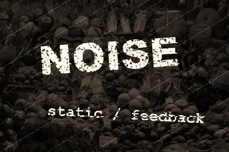
Spot it
- 01Torn, distressed letterforms
- 02Overlapping layered text
- 03Photocopy grit and stains
Why it happens
Layering, photocopying, scanning and manually damaging type adds noise and irregularity, while ignoring grids and legibility rules makes the text part of the texture.
Recreate it in Pixio
Image edit prompt“Add grunge typography to this image: ragged, distressed letters overlapping at odd angles in black and rust red, with torn paper edges, photocopier noise, ink bleed, scratches, coffee stains and layered text fragments breaking the grid, in a 1990s alternative-music magazine style. Keep the original subject and composition.”
Open PixioUpload your image and pick an image-edit model.