
Duotone Mapping
A two-color treatment that maps every brightness level to a blend between a shadow color and a highlight color. It is a staple of poster design, music artwork and bold editorial graphics.
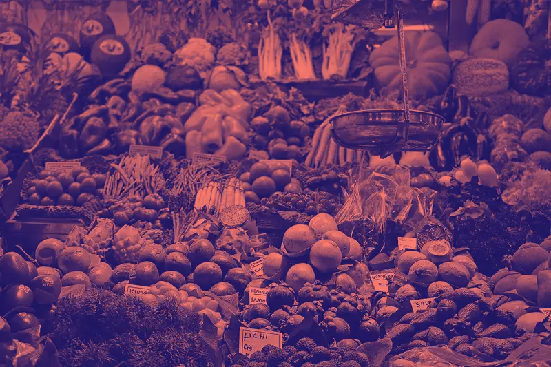
Spot it
- 01Two-color palette only
- 02Smooth tonal blend
- 03Bold graphic contrast
Why it happens
Converts the image to luminance, then uses brightness to interpolate between two chosen colors, dark for shadows and light for highlights.
Recreate it in Pixio
Image edit prompt“Apply duotone mapping to this image: convert it to grayscale, then map the shadows to deep indigo and the highlights to hot coral pink, with a smooth blend through the midtones and no other colors. Contrast is bold and poster-like. Keep the original subject and composition recognizable.”
Open PixioUpload your image and pick an image-edit model.